Year
2022 – 2023
My Contribution
- Strategy
- Facilitator
- UX Research
- UX Design
- UI Design
Intro
In this case study, you’ll get a glimpse into Priority, a project where I tackled complex UX challenges across multiple touchpoints, applied diverse research methodologies, and delivered designs that balanced user needs with business goals.

Challenge
Navigating Post-MVP Challenges
Despite the great launch, the platform faced an unexpected hurdle: declining traffic due to the Netherlands’ lockdown measures. This setback presented a unique opportunity to reassess and optimize our strategy.I was tasked with the following objective: to investigate and implement strategies that would not only recover but surpass our initial success. My focus was twofold:
- Attract and retain more visitors
- Refine the platform to align perfectly with user needs and preferences
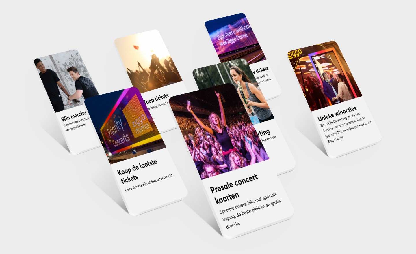
A visual of the rewards that Priority has to offer.
My role
As the UX strategist and designer for Priority, I transformed business strategy into tangible user experiences. Working closely with the agile team, I tackled challenges and guided the implementation of the loyalty program. My role included research, concept development, UI design, and validation for both current and future product offerings, ensuring a cohesive and user-centered platform experience.
“Working with Simon on Priority is such a good experience; he is very talented and driven to deliver the best user experience for our customers. Simon consistently delivers great solutions for our problems.”
Jeroen BreevoortVisual Designer, VodafoneZiggo
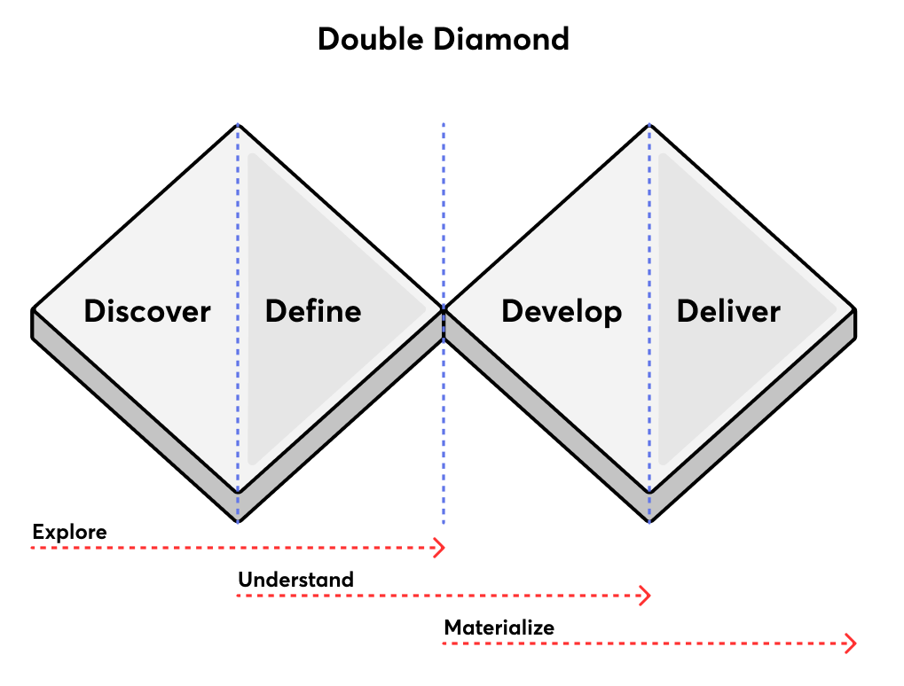
A visual of my design proces
Approach
To address uncertainties about the platform’s identity and future development, I conducted interviews across various departments. This approach provided valuable insights into the challenges we faced. By synthesizing research findings on market trends, competition, and organizational dynamics, I gained a holistic understanding of how different teams collaborated on the Priority loyalty program.
Internal analysis
Interviews with key stakeholders and colleagues from different departments.
Research
Research on competition and loyalty program trends.
Combine insights
Combining our own research with insights from data.
Debrief
Summary of the Reason, Context, Purpose, and Target Group of the Loyalty Platform
Determine the next steps
After launching the Priority Platform, we recognized the need for performance insights to guide our expansion strategy. By gathering and analyzing crucial metrics, we can make informed decisions about feature and reward prioritization in upcoming development phases. Our research identified several areas for improvement in the Priority Platform. We’ll focus on validating these areas through user research, aiming to enhance the customer experience by deepening our understanding of platform users. In collaboration with a CRO specialist and key stakeholders, we’ve established four pillars to guide our project:
- Attract: Drawing new users to the platform
- Engage: Increasing user interaction and participation
- Delight: Enhancing user satisfaction and enjoyment
- Grow: Expanding platform capabilities
These pillars, along with our defined KPIs, will steer our efforts to refine and expand the Priority Platform, ensuring it continues to meet both user needs and business objectives.
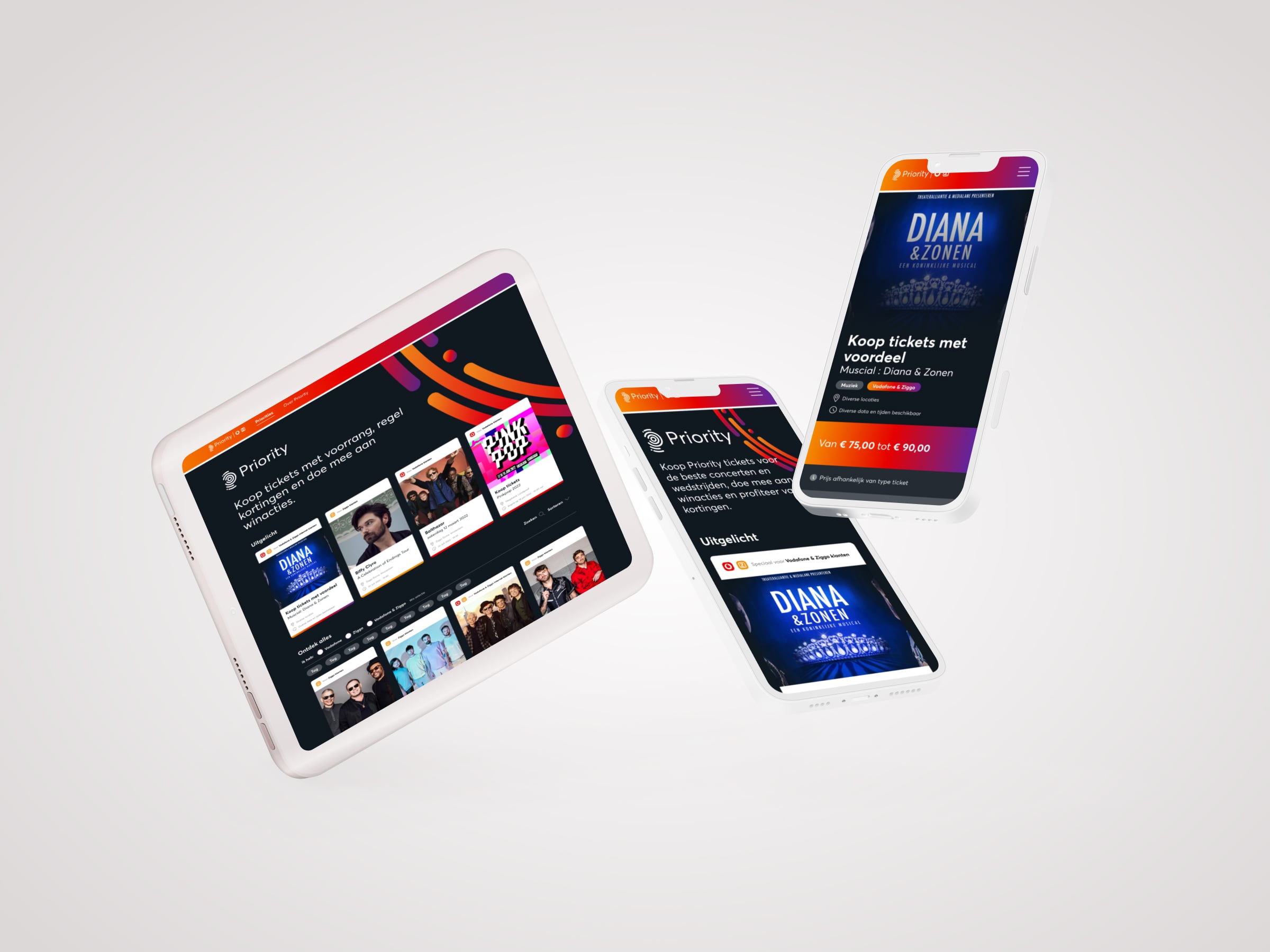
A visual of Priority’s delivered MVP
Research Objectives and Key Questions
Our research aims to enhance the Priority Platform by focusing on the following goals:
- Evaluate and improve the platform’s appeal
- Assess platform visibility and customer awareness
- Identify relevant and valuable rewards for our customers
- Explore personalization opportunities to increase relevance
- Optimize navigation structure for future platform expansion
To achieve these goals, we’ll address the following key research questions:
- What is the current perception of the Priority Platform among our customers?
- Which rewards do customers find most valuable, and why?
- How can we create a more personalized experience for our users?
- What improvements in visibility and awareness would most benefit the platform?
- How can we structure navigation to accommodate future platform growth effectively?
By answering these questions, we aim to gather actionable insights that will drive meaningful improvements to the Priority Platform, enhancing user experience and engagement.
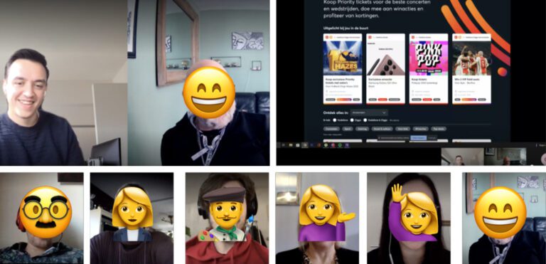
Gathering insights
While our CRO specialist was setting up measurement tools on the platform, I initiated the interview process. This research phase combined customer interviews with prototype validation. To accomplish this, I performed several key tasks:
Research plan
Established clear goals and objectives to guide our research.
Prototype Creation
Designing some main user flows and new concepts for user testing.
Interview Preparation
Recruited respondents, sent invitations, and managed all logistical aspects of the interview process.
Analysis and Reporting
Thoroughly examined collected data to identify pain points and opportunities. Synthesized findings into actionable conclusions.
This structured methodology ensured a thorough exploration of user needs and preferences, providing a solid foundation for informed decision-making and platform improvements.
Key Insights and Recommendations
After thorough analysis of our findings, I developed recommendations addressing various aspects of the Priority platform. These recommendations were categorized to align with different teams working on the project, ensuring a comprehensive approach to improvement. Below is a summary of key recommendations.
For the Agile Team:
- Enhance filter visibility.
- Clearly communicate reward benefits on the product listing page and product detail page.
- Emphasize exclusivity and promote exclusive rewards.
- Improve navigation for easier preference-based filtering.
- Include detailed ticket information and availability.
- Provide a comprehensive FAQ section.
For the Sponsorship and Partners Team:
- Standardize partner briefing for consistent reward information presentation.
- Diversify sports rewards beyond Ajax.
- Expand event offerings in Ziggo Dome / Arena.
- Implement reward tiering, prioritising ‘converged’ rewards.
For the Marketing Team:
- Increase platform visibility through frequent, cross-channel communication.
- Utilize additional communication mediums (e.g., My Ziggo / My Vodafone, TV, internet banners).
- Leverage My apps for special reward notifications and banners.
- Implement personalized monthly newsletters featuring new rewards.
These recommendations aim to address user pain points and capitalize on identified opportunities. Due to the extensive nature of our findings, this list represents only a portion of our insights. I’m happy to provide more detailed information on specific areas if needed.
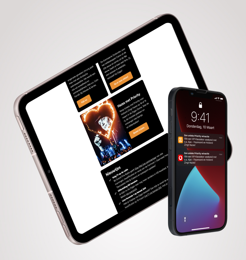
Push notifications and Priority items in a Ziggo email.
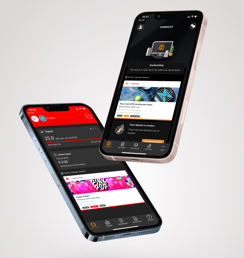
Priorities in the VF and Ziggo app.
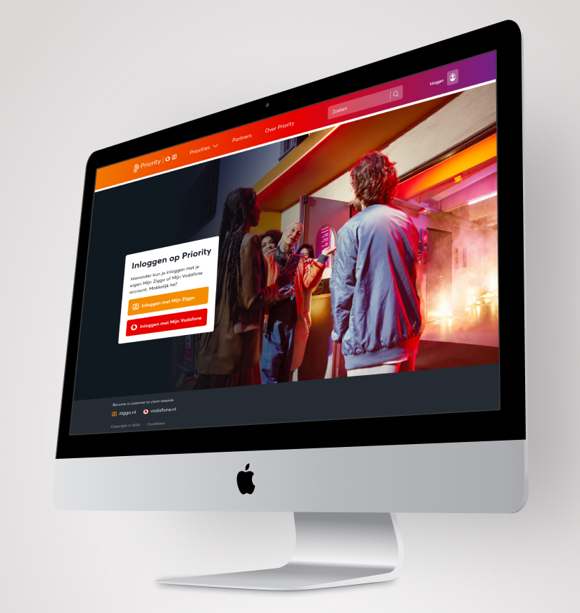
A login module on Priority.
Iterative Design Process and Validation
After presenting insights and recommendations to all stakeholders, I returned to the drawing board to translate these recommendations into tangible designs. My approach is characterized by an iterative design process, ensuring continuous improvement and alignment with both user needs and business objectives. Key steps in this phase included:
- Translating recommendations into design concepts
- Balancing user preferences with business goals
- Conducting a second round of user testing
While not every project allows for multiple rounds of user feedback, I prioritize this step whenever possible. It ensures that we effectively address user pain points and add genuine value. For this project, I used various testing methods in the tool Lyssna:
- Prototype testing to evaluate the user journey
- First click tests to evaluate navigation and user flow
- Five-second tests to assess immediate user impressions
- Preference tests to compare design alternatives
This comprehensive approach to testing allowed me to quickly validate ideas and make data-driven design decisions. By leveraging both qualitative feedback from interviews and quantitative data from online tools, I ensured that our design solutions were both user-centric and aligned with business objectives. This iterative process not only improved the overall user experience but also increased confidence in our design decisions before moving to implementation.
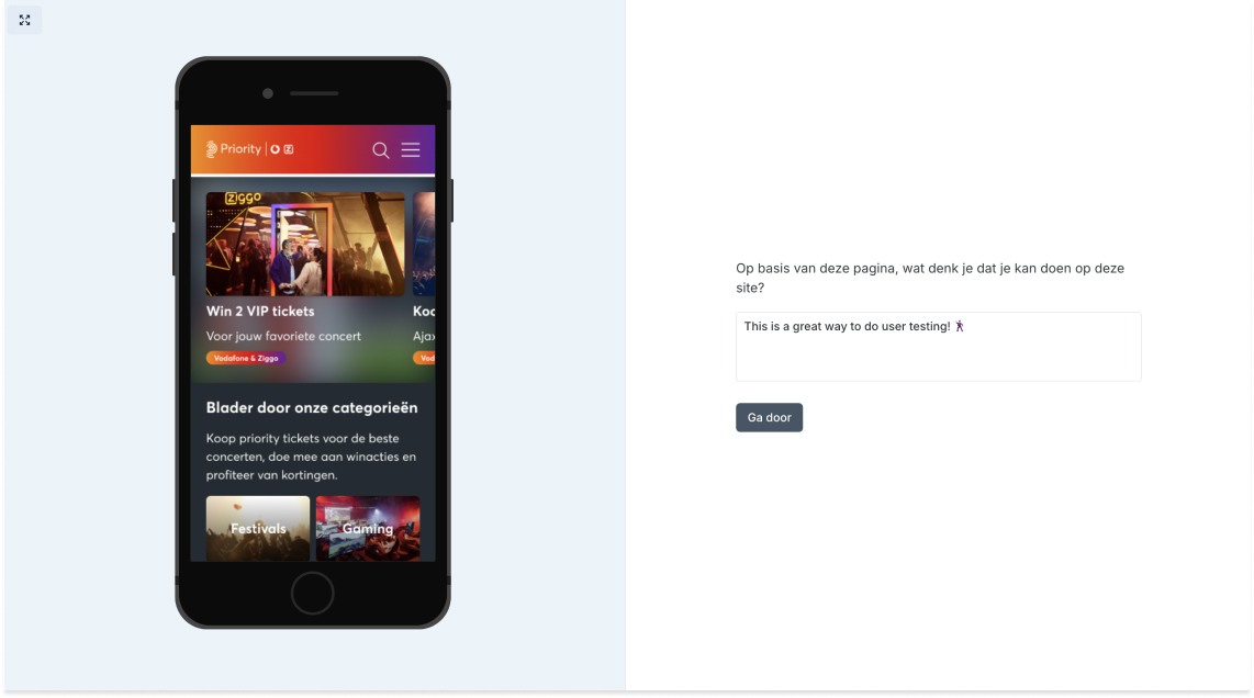
A screenshot of a user test in Lyssna.
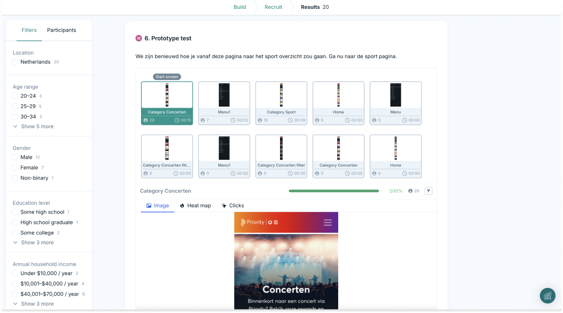
A screenshot of the backend of Lyssna
Thank you for your interest!
If you’re reading this, you’re awesome! I appreciate you taking the time to explore my case study. I chose to showcase the initial phase of my project because it often presents the greatest challenges.
As a UX Designer, I believe it’s essential to clearly articulate my process, detailing each step that led to a validated end result. This is the essence of human-centered design. Throughout the project, many uncertainties arose, and not everyone was aligned on the same working methodology. After completing these initial steps, the process became iterative.
My role was to serve as the bridge between user needs and business objectives. I implemented various research methods, facilitated brainstorming sessions, and conducted mini design sprints to drive collaboration and innovation. I’ll provide visual representations of some of these activities to give you a better impression of the process.
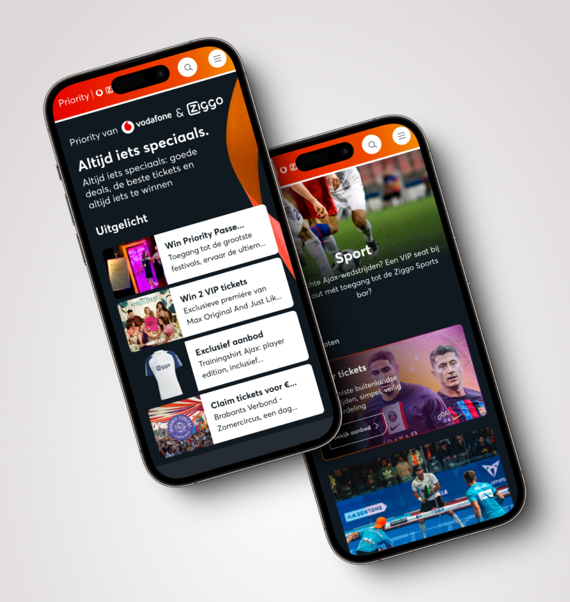
A new tested design for the home and category page.
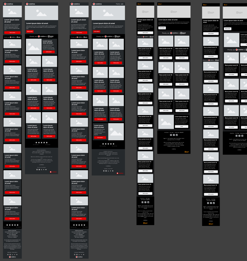
Creating Priority newsletter templates.
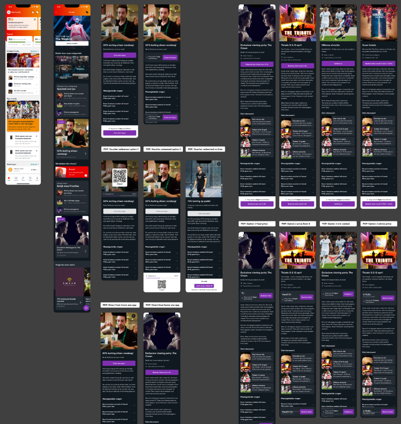
Creating a user test for Priority in the native VFZ app.
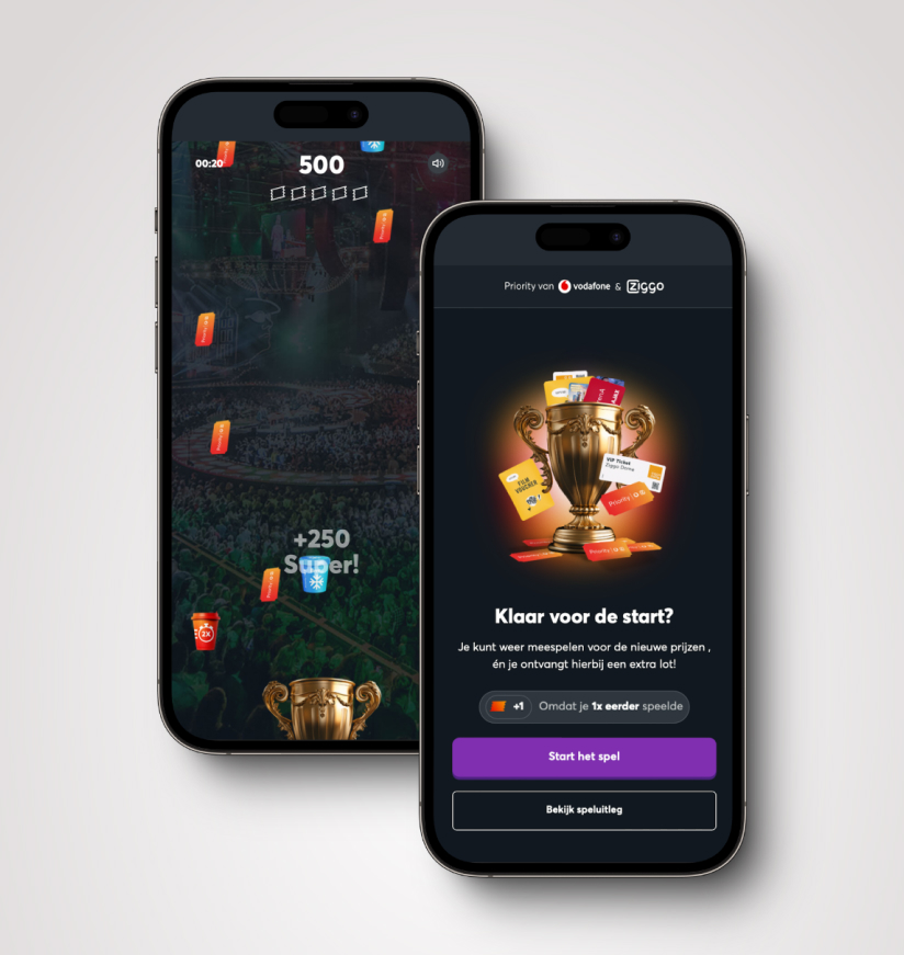
Creating the Priority Game: increasing engagement through gamification.
Results
Let’s talk numbers!
Overall, this project was both enjoyable and educational. I want to extend a heartfelt thank you to my agile team, the marketing team, and the sponsorship team for their collaboration. Together, we achieved remarkable results through our collective initiatives. Here are some numbers reflecting the results we have achieved over the past year:

