Year
2020 -2021
My Contribution
- UX Research
- UX Design
- UI Design
Intro
In this case study, I’ll walk you through the iterative design process for the Vodafone SaaS business portal transformation. I will outline each phase of the iterative design process and share the insights gained along the way. I started by mapping the current situation to gain a clear overview of all processes and systems, user roles, and stakeholders.

Challenge
From Current Situation to the Desired Situation
Vodafone’s existing portal was not just technologically outdated; it had to be transferred to a new stack. This situation was a perfect opportunity for an overall improvement. We saw this as a chance to:
- Modernize the technical infrastructure.
- Enhance the user experience and interface.
- Align the portal with current customer needs and expectations.
By leveraging this moment, we aimed to create a portal that wasn’t just a technical upgrade, but a transformative leap in how our business users interact with Vodafone.
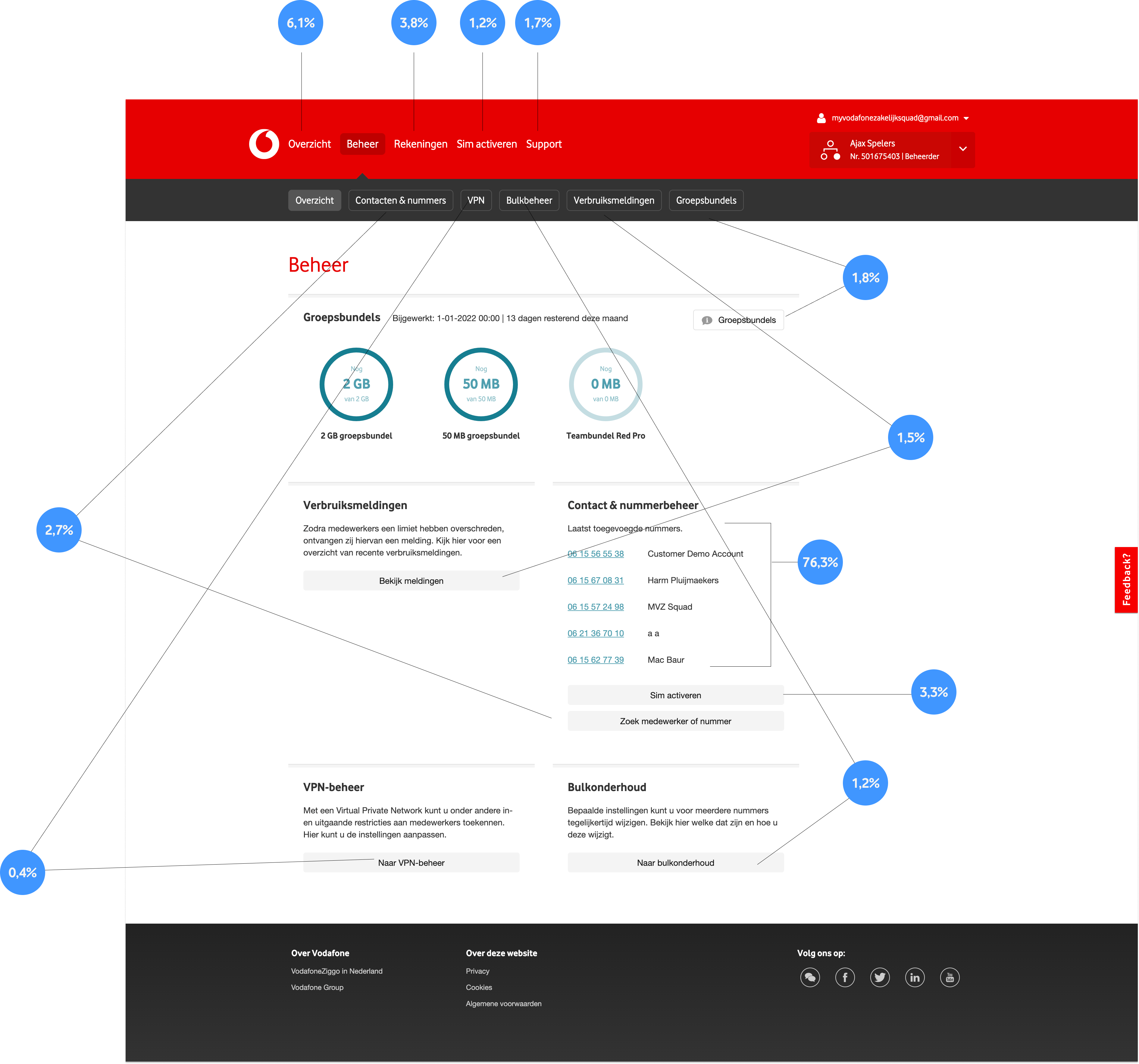
An analysis of one of the main pages of My Vodafone Zakelijk.
My role
As the UX Designer, I followed an iterative design process. I created concepts and worked them out to final implementation. My responsibilities included:
- Mapping the current ecosystem to gain an understanding of existing processes, user roles, and systems.
- Conducting in-depth user research to uncover pain points and opportunities within the customer journey.
- Developing intuitive design concepts that simplified account management and service access for business users.
- Creating and iterating on prototypes based on user feedback and data insights.
- Validating design solutions through testing and analysis.
- Collaborating with the agile team to ensure seamless integration of the design improvements with the new technology stack.
Approach
Deep dive into user needs
I conducted an in-depth analysis of the data and engaged directly with users to identify their challenges. I explored the current pain points they face and gathered insights on the improvements they would like to see.
User interview 1 of 5
User interview 2 of 5
User interview 3 of 5
Insights & Recommendations
Based on both quantitative and qualitative research, I created recommendations to enhance the user experience, which I presented to all stakeholders. After incorporating their feedback, I began the design phase. Here are a few key takeaways:
- The portal offers many features, making it challenging to navigate and find the right one.
- The management section is overly complicated.
- It is unclear how much data remains within group bundles.
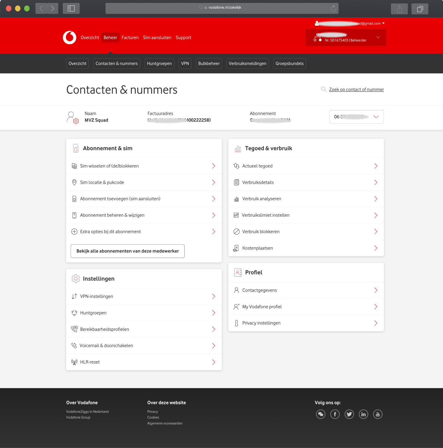
New design of Contact & nummers subscription level
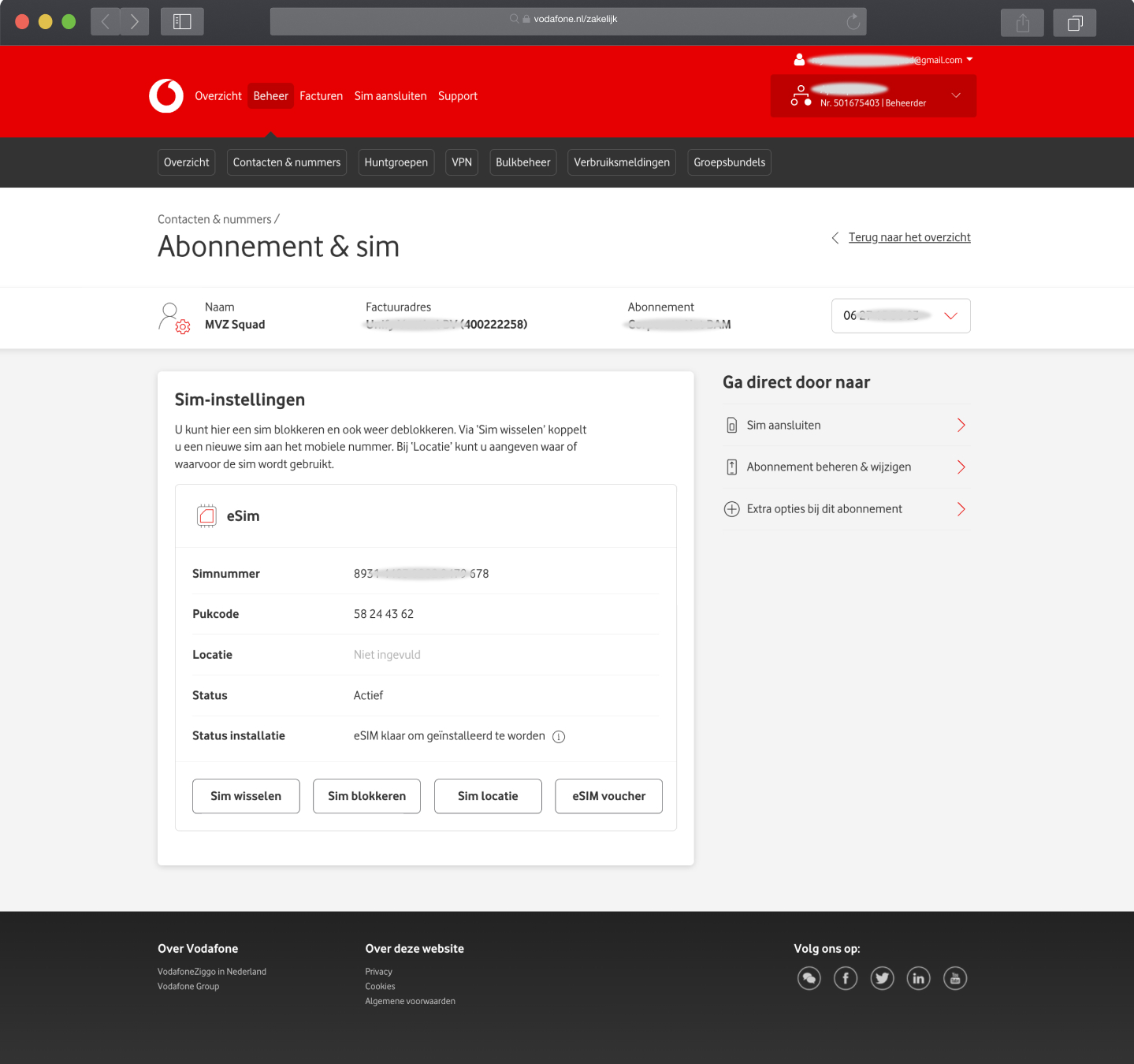
New design of Contact & nummers detail

New design of the main overview page
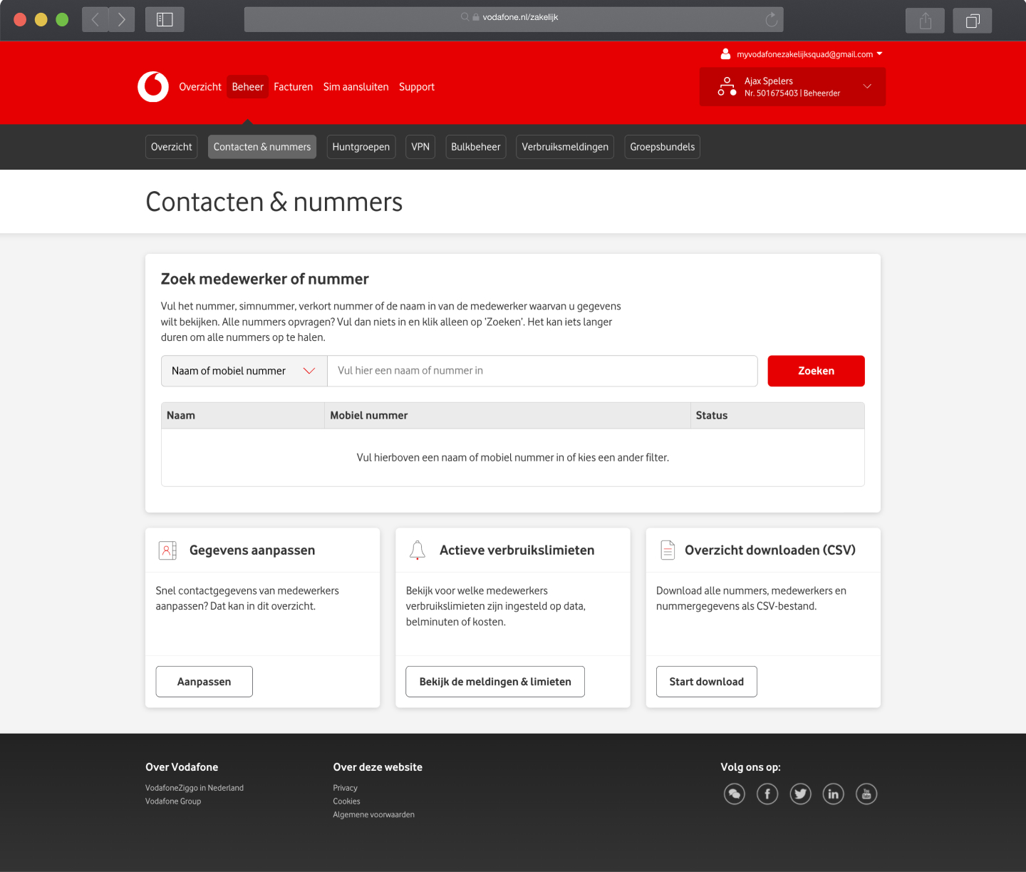
New design of Contact & nummers
Design Choices
A key insight was that the portal’s navigation was challenging due to its many features. To address this, I placed the most frequently used functionalities on the overview page, enabling users to quickly initiate their intended tasks. Additionally, I incorporated a quick-access menu within the management section, facilitating seamless transitions between related tasks. I also changed the design of group bundles to enhance clarity and usability. Before finalizing these designs for development, I conducted thorough testing using Lyssna to validate their effectiveness and user-friendliness.
During the research it also emerged that the different roles use the platform for almost 90% on desktop. For this we have chosen to only make certain features available on mobile for certain roles of the platform. With this we have saved considerable dev capacity and made the platform even better aligned with the needs of the users and different roles.

New mobile design of Contact en nummers
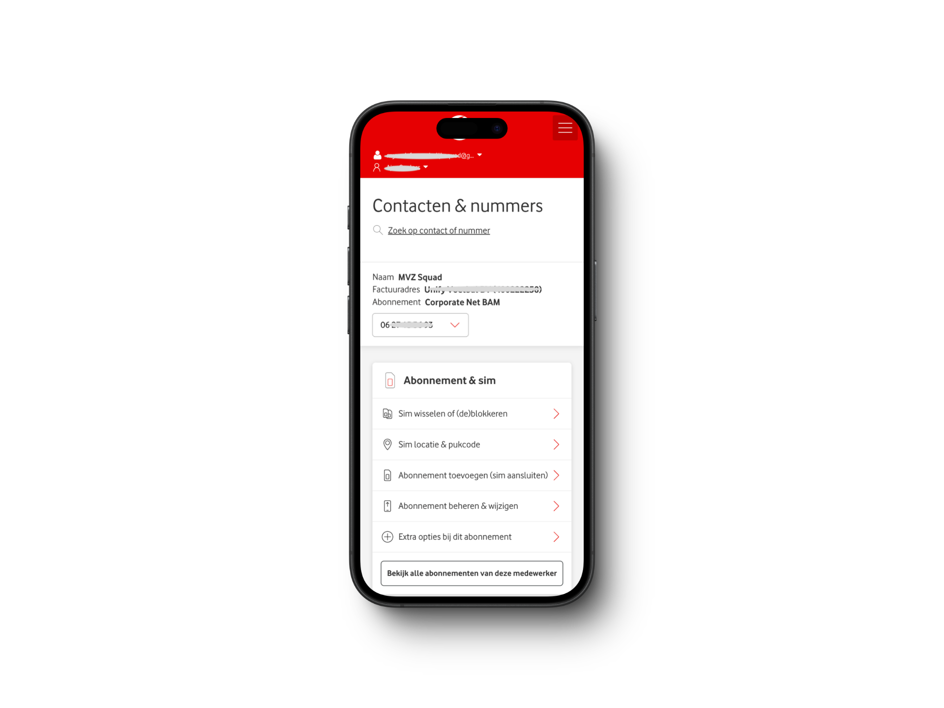
New mobile design of Contact en nummers detail
Result
The result was that we designed and developed almost all used flows in My Vodafone Business portal. This project improved the user experience for Vodafone’s business customers and modernized the technical infrastructure. Key points of the project include:
- A complete redesign of the portal’s user interface
- Implementation of current and new features
- Focus on improving user needs
