Year
2024
My Contribution
- Facilitator
- UX Research
- UX Design
- UI Design
Intro
In this case study, I’ll walk you through the iterative design process for Ziggo’s “Alles-in-1” (All in one) page transformation. Our journey kicked off with a dynamic workshop, where I collaborated with the CX specialist to bring all the stakeholders together in one room. We dove deep into data analysis, using these insights as a starting point for the concept development.
This collaborative and fun approach set the stage for our transformative redesign. From there, we started on two rounds of prototyping, concepting, and validation testing. Working hand-in-hand with the CRO team and the Marketing departments, we refined our ideas and designs.
The result? A streamlined “Alles-in-1” (All in one) page that promises to simplify decision-making for users and boost conversions for Ziggo.
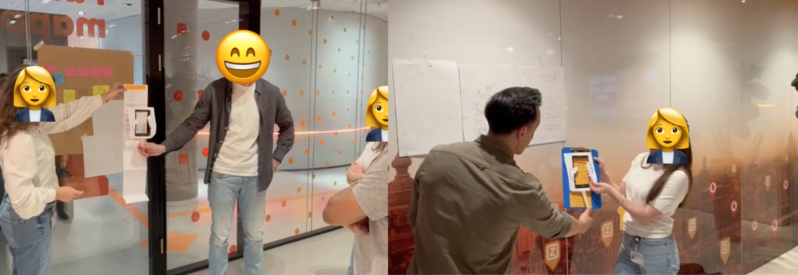
Kick-off workshop
Challenge
Simplifying the internet packages
Simplify choices and enhance the user experience, turning a complex page into an intuitive, user-friendly interface. This iterative process allowed us to continuously improve our designs, ensuring that each iteration brought us closer to a solution that not only met the user needs but also aligned with Ziggo’s business objectives.
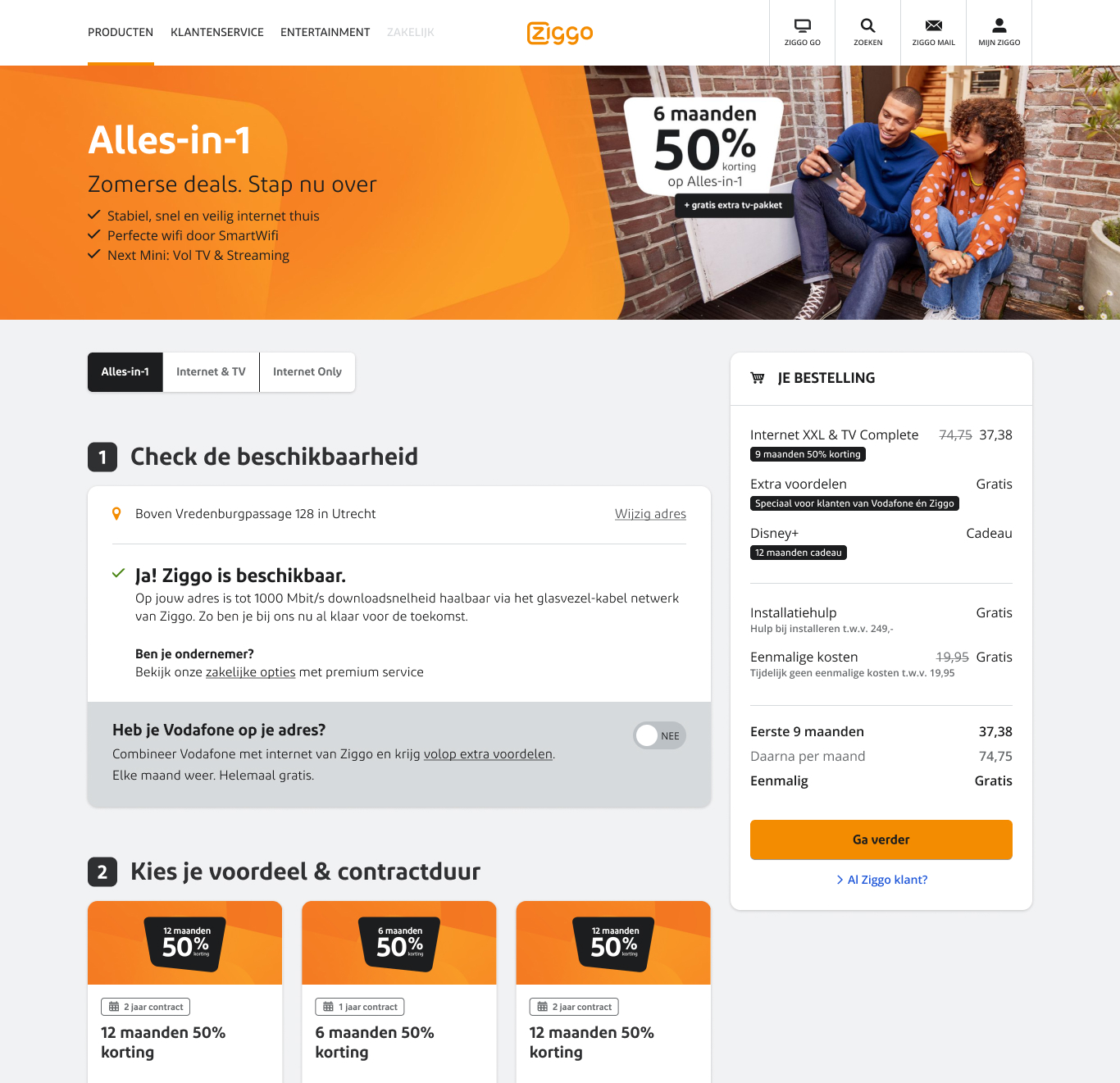
A visual of a previous version of the “Alles-in-1” page.
My role
As the UX Designer, I needed to bridge the gap between our telecom offerings and user-friendly digital experiences. My responsibilities included:
- Conducting in-depth user research to uncover pain points and opportunities
- Developing intuitive design concepts that simplified package selection
- Creating and iterating on prototypes based on user feedback and data insights
- Validating design solutions through testing and analysis
By balancing user needs with business objectives, I designed engaging interfaces that enhanced the overall user experience.
Approach
Deep dive into user needs
I conducted user research to understand pain points and analyzed competitor offerings along with industry best practices. I turned the information into easily digestible components and validated the design with users.
Data analysis
Taking a deep dive into the current data of this page.
Prototype creation
Prototyping the concepts from the workshop.
User research
Conducting user interviews and taking observations.
Analysis and Reporting
Examined the collected data to identify pain points and opportunities.
Research questions and Objectives
Enhancing the online sales journey:
- Which elements of our concepts could streamline and improve the overall sales flow?
- How can we make the journey from browsing to purchase smoother and more intuitive?
Capturing attention and emotion:
- What aspects of our designs truly resonate with potential customers on an emotional level?
- Which elements create that “wow” factor that could set Ziggo apart from competitors?
Delivering practical value:
- Which features do prospects find most useful and functional?
- How can we ensure our design not only looks good but also serves real user needs effectively?
By examining our concepts through these perspectives, we aimed to create a design that was not just visually appealing, but also emotionally engaging and practically useful for Ziggo’s potential customers.
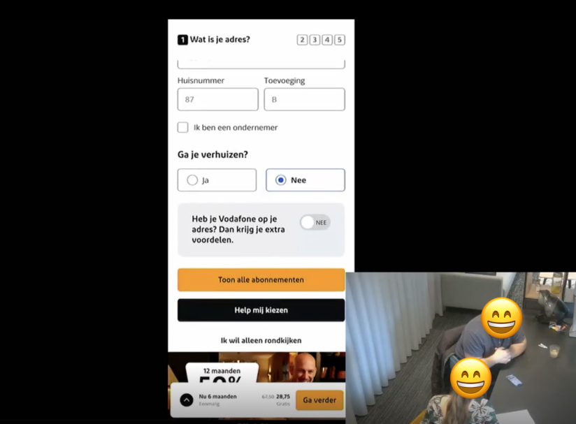
User interview 1 of 6 in a research lab
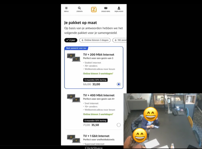
User interview 2 of 6 in a research lab
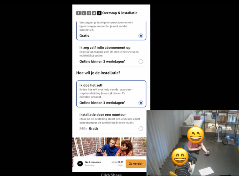
User interview 3 of 6 in a research lab
A few main insights
- There is a clear need for package comparison to find the best fitting deal.
- Detailed information required before ordering.
- Unclear descriptions and terminology used across the journey.
These are just a few insights from the research. I’m happy to provide more detailed information on specific areas if needed.
Conclusion and Recommendations
Together with an UX Researcher, we analyzed all the insights. Based on this, we have described recommendations for all items. We have discussed these recommendations with the stakeholders. A few recommendations:
- Provide logical order of elements.
- Online help – define correct entry and journey.
- Online advice – allow for more detailed info.
Iterative design proces
Through user interviews, we uncovered valuable insights that informed our design process. Leveraging these findings, I began creating iterations of our concepts. We then tested these iterations with customers to gather feedback and refine our approach further.
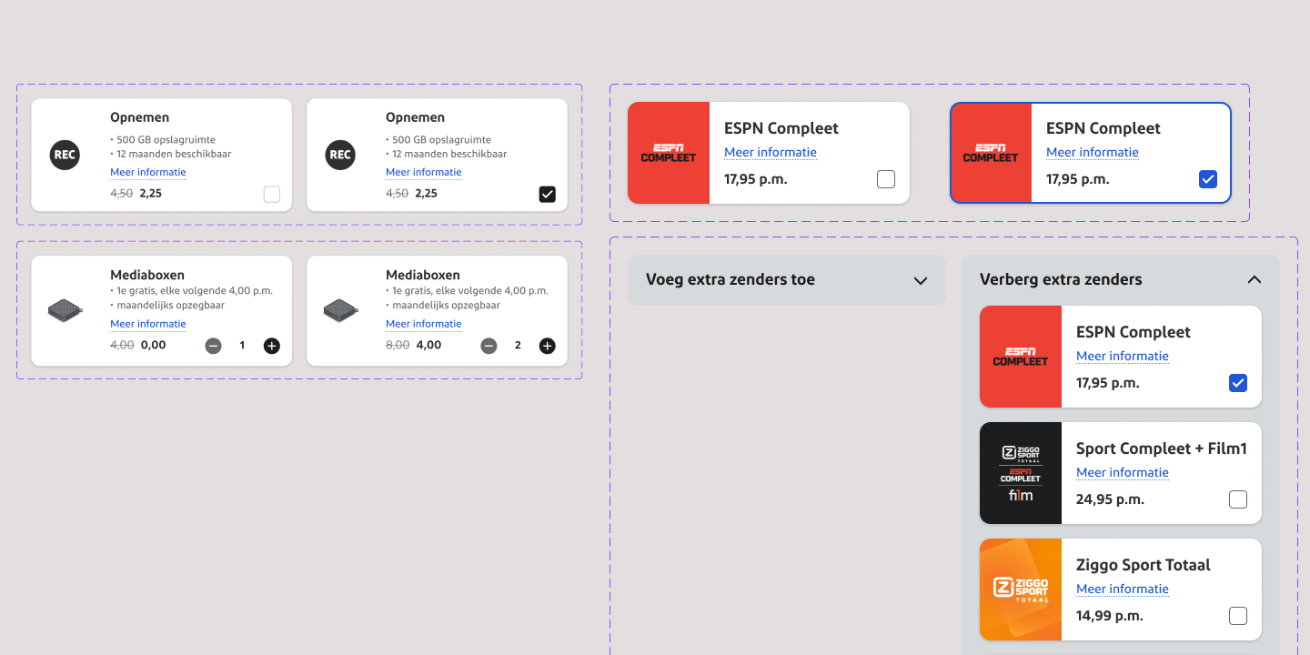
Creating interactive components for the prototype.
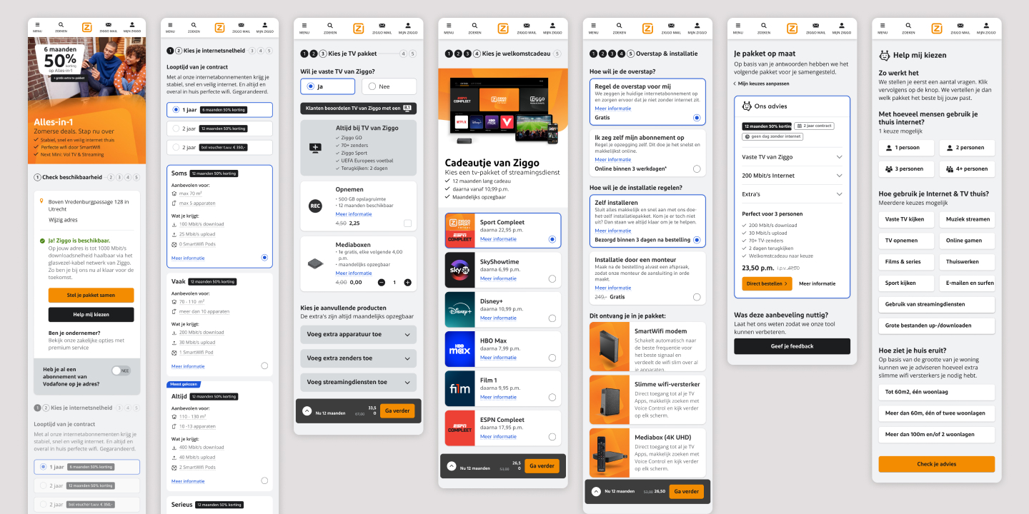
Creating an interactive prototype.
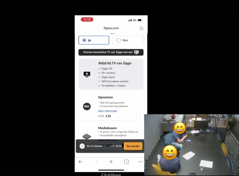
User interview 1 of 6, round 2, in a research lab.
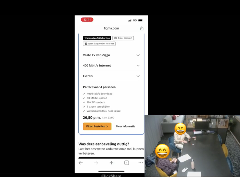
User interview 2 of 6, round 2, in a research lab.

User interview 3 of 6, round 2, in a research lab.
Results
Project outcome
This project was both enjoyable and educational. Collaborating with various specialists allows you to approach problems and solutions from multiple perspectives. By partnering closely with the CRO specialist, we transform raw data into actionable ideas and innovative concepts. All designs are currently being made dev ready and I have split up user stories to tackle with the agile team. The project has led to a streamlined “Alles-in-1” page that promises to simplify decision-making for users and boost conversions for Ziggo.

